
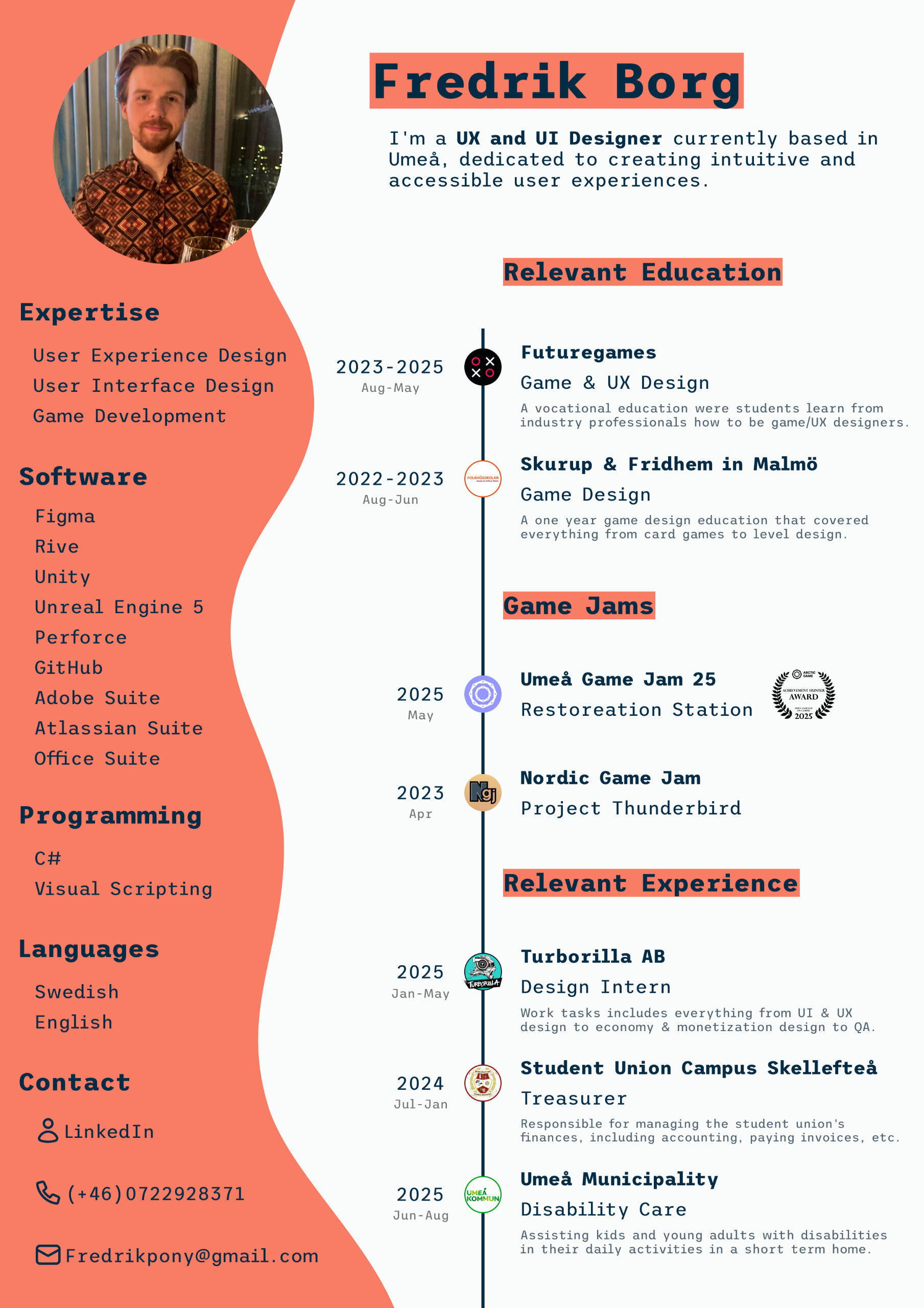
Hello,👋 I'm Fredrik! A UX & UI Designer🔧 with a passion for creating user friendly and accessible experiences.✨
I have studied Game Design at Skurup & Fridhems Folkhögskola in Malmö, and am now studying UX & Game Design at Futuregames. Currently I'm doing my internship with Turborilla in Umeå.I grew up loving games and I still do, which is why I'm so passionate about user experience and accessibility. I believe that games can and should be a source of fun, relaxation, socialization, and more for everyone, regardless of any perceived or real obstacles.

Mad Skills BMX 2, UI/UX Enhancements
UX & UI Design
Pokémon TCG Pocket, UI Redesign
UI & UX Design &
Research
Vector Flux
UX & UI Design,
Research & Programming
Mad Skills BMX 2, UI/UX Enhancements
Improving UX for a Mobile-to-Switch Release at Turborilla


Team Size🧍
4 developers
My Roles🤠
UX & UI Designer
Duration🕓
2 Months
(still under development)
Tools Used🔨
Figma, ClickUp,
Google Workspace
Project Goals
- Improve track progression visibility after each race.
- Enhance the game's store offers and monetization.
- Streamline bike selection and early-game purchases.


Designing UX for an Existing Game
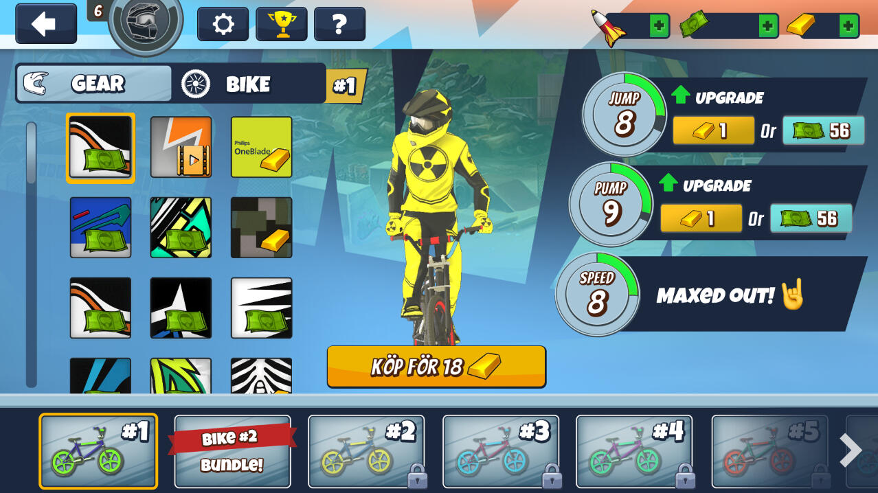
As a design intern at Turborilla, one of the tasks I was given was to work on Mad Skills BMX 2, a mobile racing game with over half a million monthly users, preparing for its Nintendo Switch release. Since a full redesign wasn’t within scope, my task was to refine key areas of the UI to improve player experience while keeping the core game intact, and working well for both console and mobile.To achieve this, I:
Designed a system within the core loop to show players how they’re progressing after each race. While also giving them a long term goal by showing how close the next boss is.Enhanced the visual hierarchy of pop-ups for clearer communication.Redesigned the UI for purchasing new bikes to make it more easily navigable, and to display all bikes early on.Optimized In-Game Offers by iterating on a list of pack offers tailored towards different kinds of players.Added an easy-access “cheap no ads” button within the core loop.Made store offers more visually compelling and structured.


Process
Research & Ideation – I analyzed the existing UI, gathered ideas from the team, and reviewed mobile UX best practices.Wireframing & Prototyping – I created mockups and iterated based on team feedback.Collaboration & Validation – I presented designs, refined them with feedback, and documented the final versions in ClickUp.Implementation Support – I worked closely with an artist and programmer to bring the designs into the game.
Takeaways
This project strengthened my ability to design within constraints, balancing UX improvements with business goals in a real game company. I learned the nuances of designing effective in-game offers, improving store clarity, and refining UI without disrupting an existing game. Additionally, working on a mobile-to-Switch adaptation gave me insight into the unique considerations of each platform.


Pokémon TCG Pocket, UI Redesign
Redesigning for improved UX – Futuregames Graduation Project
Team Size🧍
Solo
My Roles🤠
UX & UI Designer & Researcher
Duration🕓
5 weeks
Tools Used🔨
Figma, Photoshop
Project Goals
- Fix key UX issues through UI redesign.
- Improve my Photoshop skills.
Finding the Problem
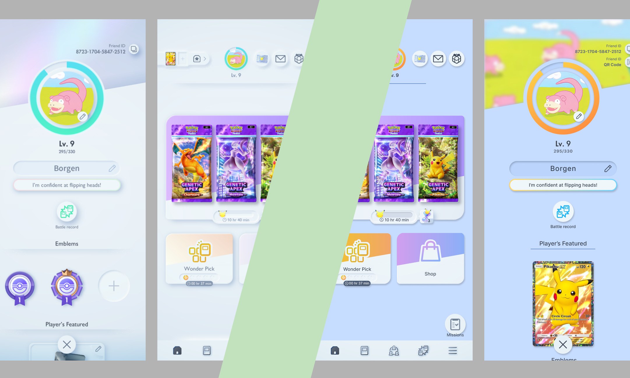
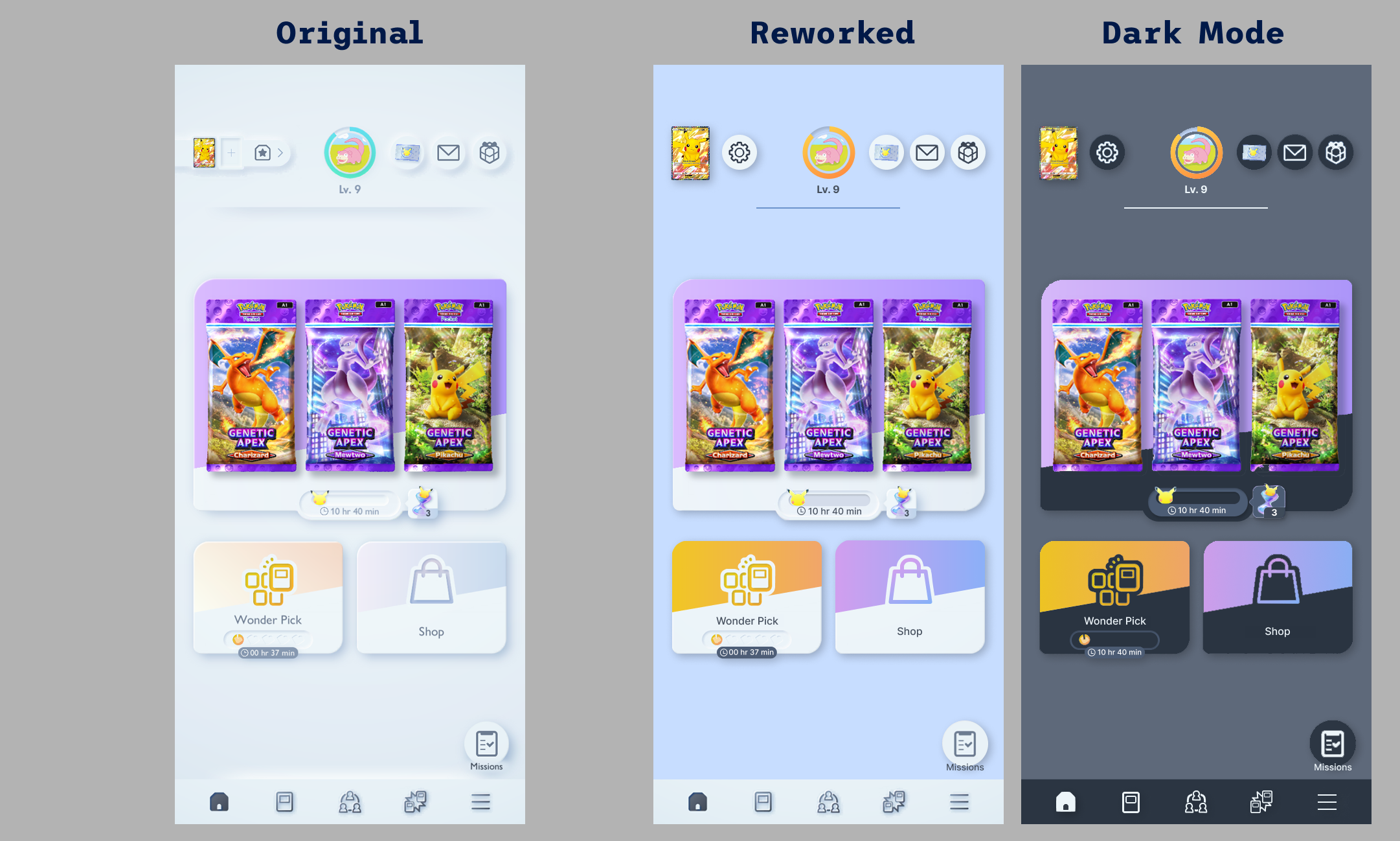
For my Futuregames graduation project, I redesigned the UI of Pokémon TCG Pocket with a focus on UX and accessibility. Despite its popularity, the game had many negative reviews, highlighting areas for improvement. This project allowed me to explore usability enhancements while also sharpening my Photoshop skills.
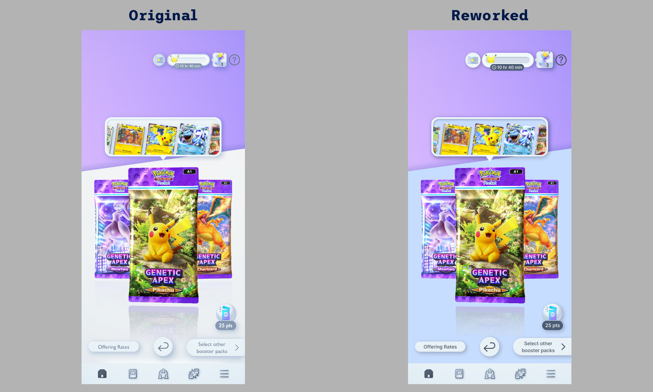
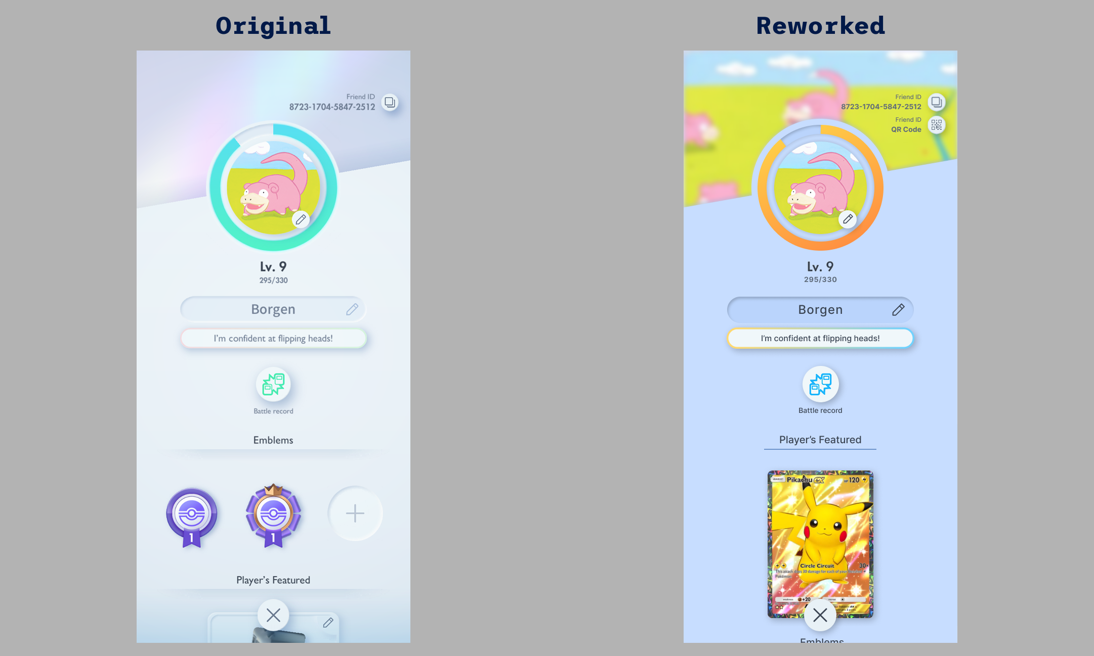
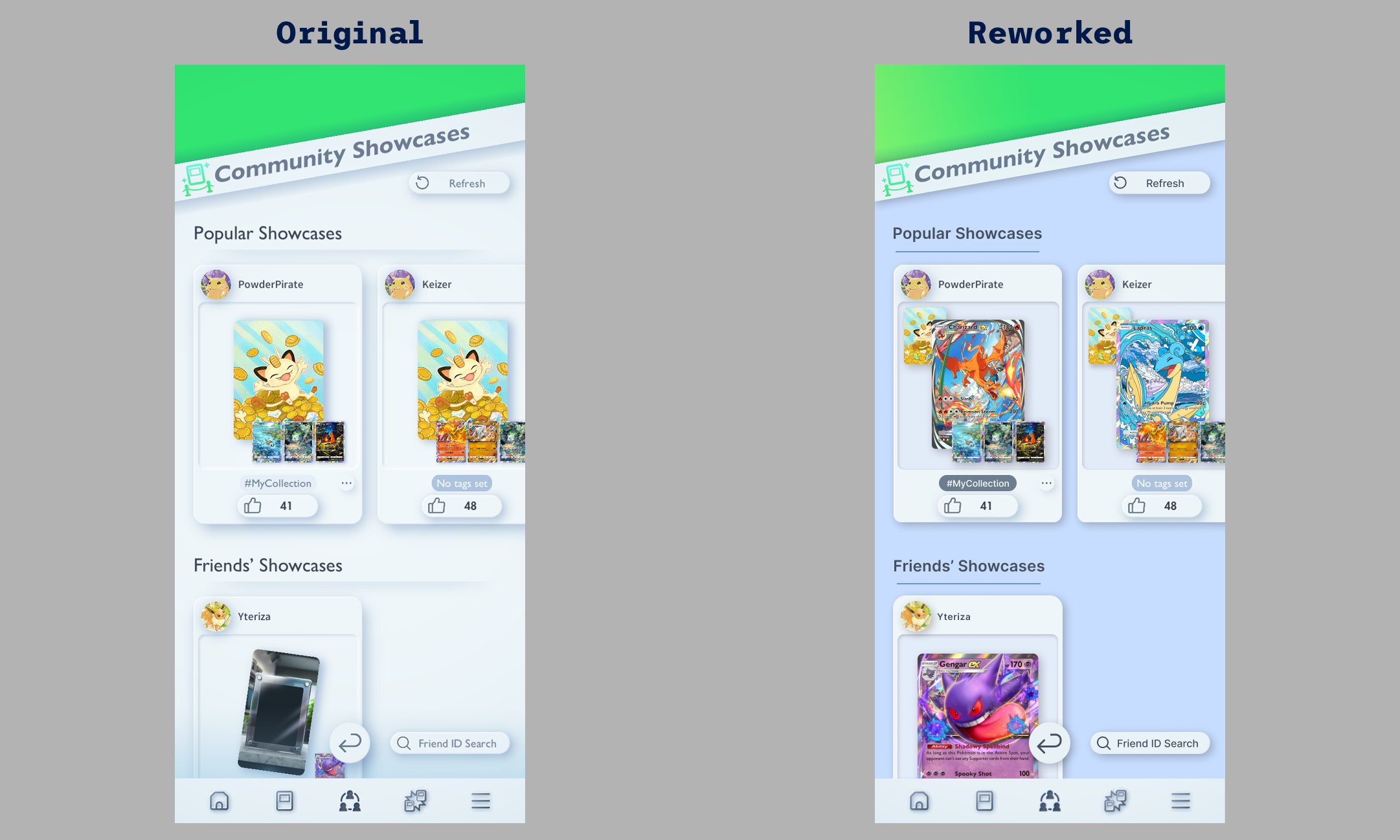
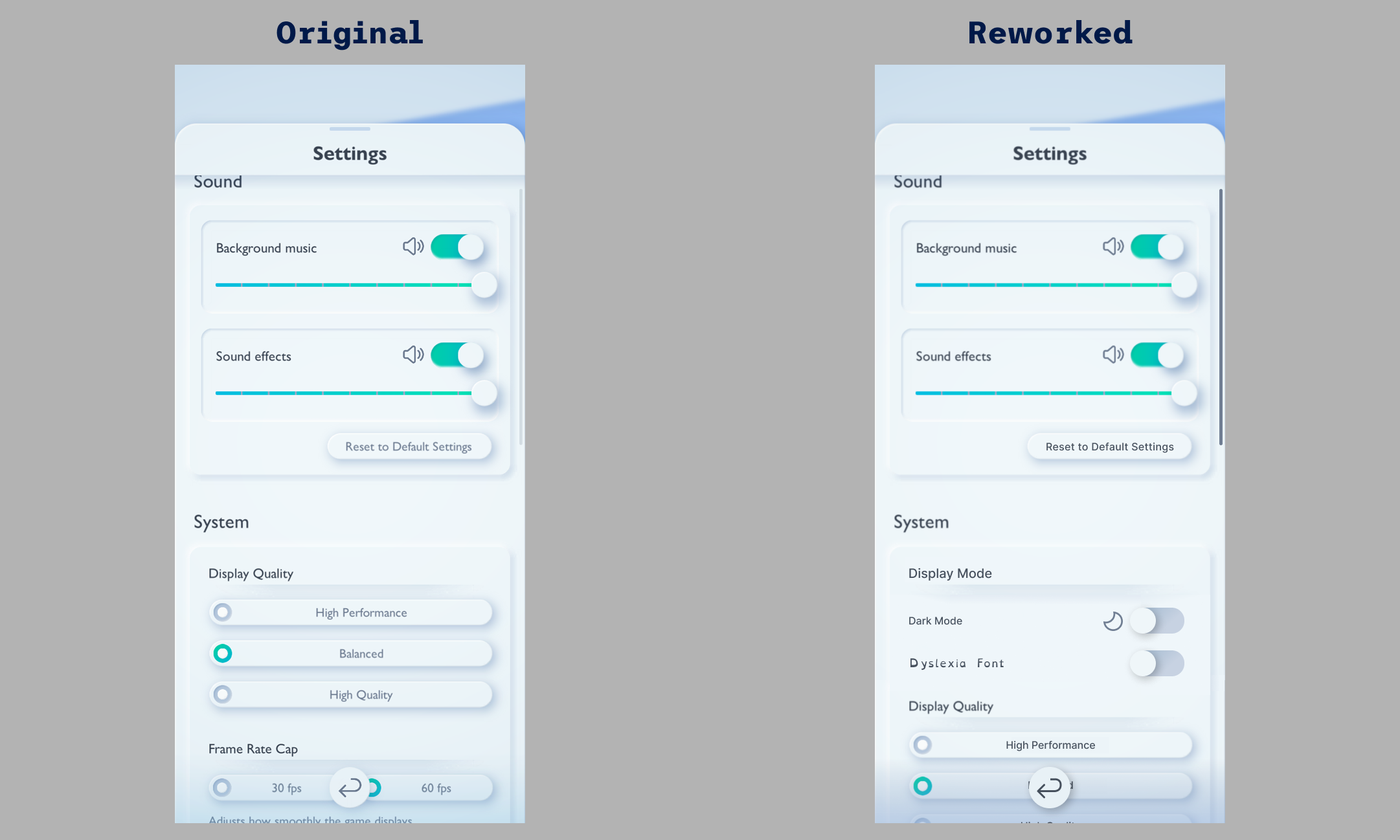
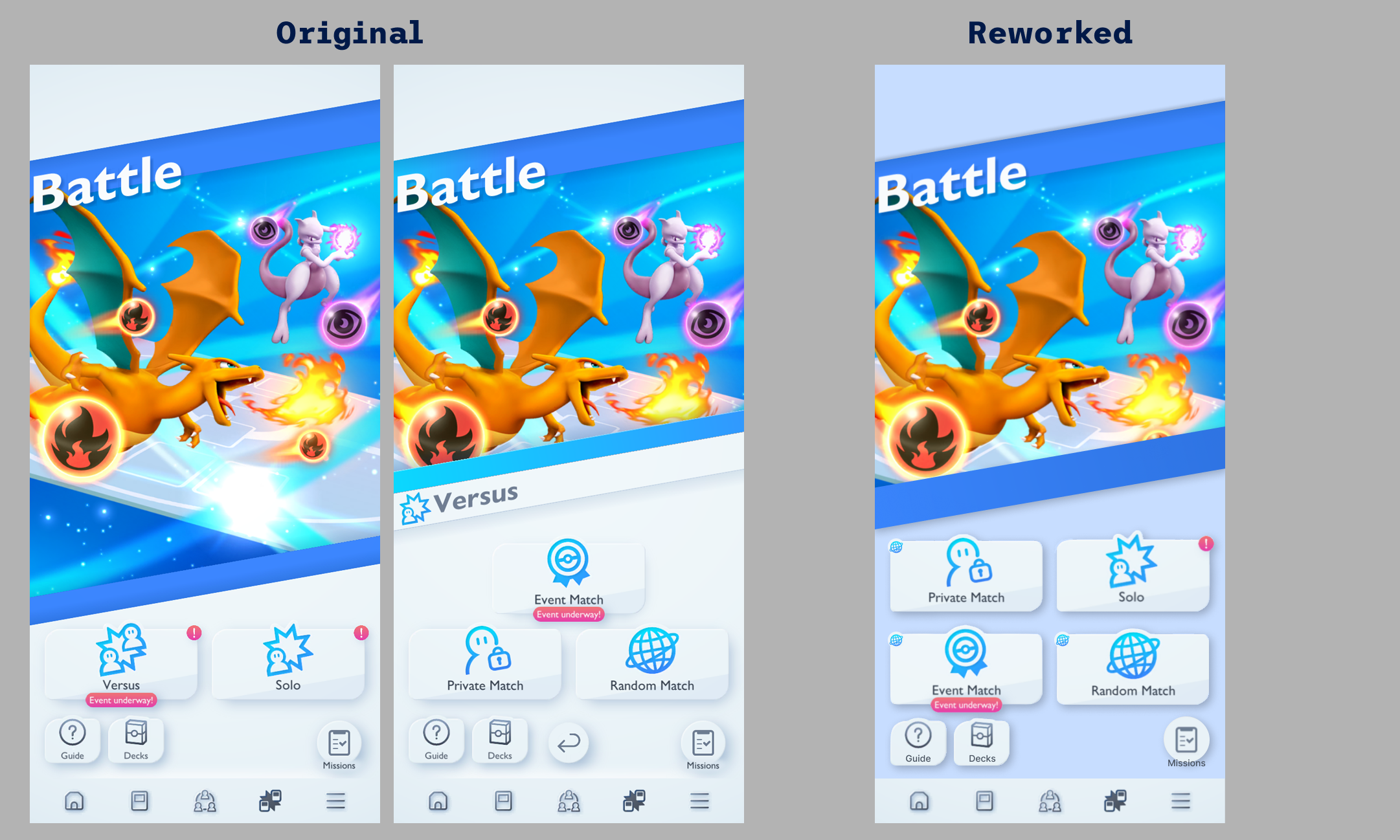
Solving Problems Through Iteration
I began by researching and gathering data by playing the game myself, observing classmates, and analyzing player reviews. This helped me identify key UX issues to address. I then collected UI references and compiled a list of problems to tackle. From there, I iterated through design solutions, refining them based on mentor and peer feedback through testing and discussions.


Takeaways
I initially overscoped this project, as it was my first large-scale UI redesign. However, I still achieved most of my goals and learned valuable lessons along the way. I significantly improved my Photoshop skills and deepened my understanding of mobile UI design. This project also reinforced the importance of usability testing and data-driven decisions. Testing early and iterating quickly led to stronger results.

Vector Flux
Exploring motion-sickness friendly FPS design
Team Size🧍
3 developers
My Roles🤠
UX & UI Designer & Researcher, UI Programmer
Duration🕓
5 weeks
Tools Used🔨
Figma, Unreal Engine 5, GitHub, Jira
Project Goals
- Minimize motion-sickness in first-person gameplay.
- Build a menu system focused on clarity and ease of use.
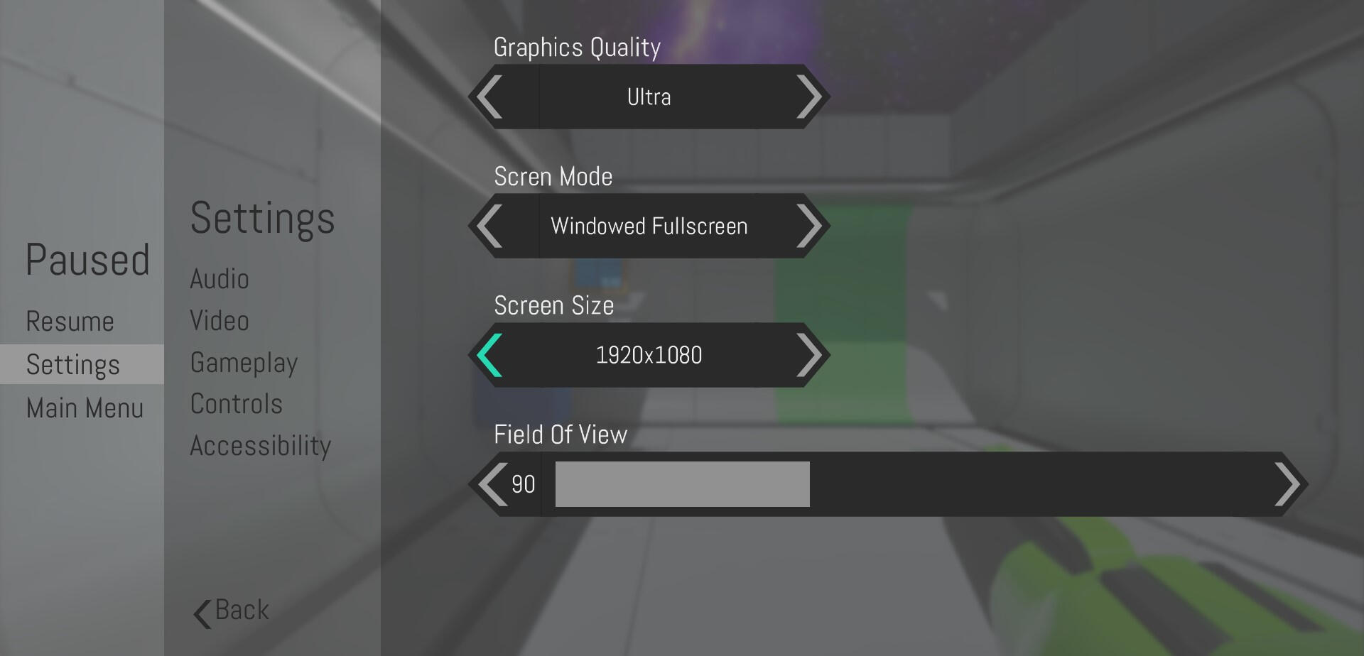
Solving the Motion Sickness Problem
Vector Flux was created in five weeks as a group project among students from my class at Futuregames. I was part of a three person team whose goal it was to create a first person game, which reduces the amount of motion sickness felt by players as much as possible.From looking at user reviews of popular first person puzzle games like Portal 2 and Outer Wilds. We found that a substantial part of the player base experienced motion sickness or nausea while playing these games. This is due to the fast player movement in some parts of the games, in combination with the first-person perspective.During the project my primary responsibilities were to design and implement intuitive user interfaces that fit the game. As well as assisting the team with researching motion sickness by looking at player reviews, reading study reports and making forms in order to gather data.


Designing Menus Through Research
Once we felt that we had found enough data to proceed. We looked at the most common solutions players had to combat their motion sickness. Some of these were having settings like an FOV slider and look sensitivity slider. So I made sure to include these settings in my menus.Then I looked at modern UI designs for PC & Console to find inspiration. Games like Satisfactory and Sam & Max: The Devil's Playhouse really stood out to me as aesthetically pleasing yet simple and easy to use. Since we wanted to reduce motion sickness I also wanted to have a toned down design in terms of color. My reasoning was that it is easier on the senses and also ensures that people with reduced vision can navigate the menus.


Takeaways
This project deepened my appreciation for UI programmers. Implementing my own designs gave me valuable insight into the challenges of UI development and how to better collaborate with engineers.I also gained hands-on experience designing for motion sickness in first-person games, testing solutions like slower movement and FOV adjustments. This reinforced how small design choices can greatly impact player comfort.Lastly, stepping away from my usual colorful UI style pushed me to explore a more minimal, functional approach that prioritizes clarity and usability.

